15 Mind Map Templates to Visually Organize Information
BY SARA MCGUIRE, AUG 09, 2018

“How can you connect ideas, show the relationship between parts, and expand on concepts?
Mind maps.
A mind map is a type of chart that organizes information visually. Typically, a mind map will stem from a central idea, with supporting ideas branching out from it in a nonlinear order. But as you’ll see in this guide, a mind map can take many forms.
Because mind maps are so popular and widely understood, they’re perfect for including in presentations, blog posts, reports–anywhere you would want to present information visually.
In this guide, I’ll share tips and best practices for creating mind maps that are as fun to look at as they are effective. I’ve also included a bunch of creative mind map templates you can use.
1. Start with one central idea and work outwards
Typically, mind maps start with one central idea. Place that central idea in the middle of your mind map, and branch out your supporting ideas radially around it.
Focus on one keyword for each idea. Then, break down those ideas further using nodes, or simply form notes.
2. Come up with a design concept for your mind map
If you want to make a mind map that is engaging for readers, you should follow some basic principles for good infographic design. If you plan on sharing your mind map in a presentation, blog post, or any form of longer content where you want to keep readers engaged, come up with a design concept for your mind map.
Your design concept will determine what kinds of supporting visuals you include, what colors you use, and how you choose to lay out your mind map.
For example, this mind map template uses an image of a lightbulb as the focal point, to reflect the theme of “thinking” and “ideas”. The supporting visuals help to illustrate each idea that branches off from the concept of “design thinking.”

3. Use multiple colors to differentiate ideas from each other
Color selection isn’t just important for making your designs look nice. It’s also an important part of making your charts more readable.
Colors can help you organize information and draw attention to specific points. In the mind map example below, a solid black color draws attention to the central idea. The supporting ideas are all different colors, which helps them stand out from one another. This makes the mind map easier to scan.

4. Avoid cluttering your mind map design by using a neutral color scheme
In certain cases, like if you’re sharing your mind map on social media or in a blog post, you may want to make your mind map especially eye-catching, with lots of decorative visuals. But in other cases where you simply want to communicate the information as clearly as possible, like in a report or internal presentation, plain and direct is more effective.
A neutral background with a few accent colors will prevent your mind map design from looking cluttered and overstuffed. Clean, simple shapes and lines are easy for the eyes and brain to process.

5. Use different line widths to create a visual hierarchy
Visual hierarchy is all about creating different visual weights by varying size, shape, color, position, and density.
For example, in this mind map template, the perceived density of the shapes creates two levels of hierarchy–a dense, filled (and visually salient) central idea surrounded by lighter, outlined ideas. Put more simply, more ink commands more attention!

6. Use different sized circles to create a visual hierarchy
Another way to create a visual hierarchy is to use different sizes shapes in your mind map. Give high-level ideas bigger circles, and supporting ideas smaller circles. This helps indicate that the supporting ideas are part of a larger whole.
Take a look at how size is used to create a hierarchy in this mind map template:

7. Use double lines to create a visual hierarchy
Yet another way to create visual hierarchy in your mind map is to double up on key connecting lines. In the mind map template below, the supporting ideas (storage, forms, and generation) connect to the central idea with double lines. Then, the supporting ideas that branch off from them only use single lines.
Once again, the more ink there is in one place, the more attention there will be drawn to that part of your mind map.

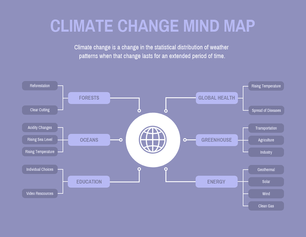
8. Color code different branches of your mind map to connect ideas
Like I already mentioned, color can be used strategically to make your mind map easier to read. While you can use a different color for each idea, you can also use colors to connect ideas.
For example, this mind map breaks down a business strategy into three branches: marketing, customer service and productivity. Each of the three branches has its own color. This emphasizes the three branches of the strategy and also makes it easier to scan for specific information.

9. Use icons to illustrate ideas on your mind map template
Icons are simple vector graphics that illustrate ideas. Because they’re so simple and space-saving, icons are perfect for including in your charts.
Use icons to illustrate ideas and make them easier to remember. For example, this mind map template uses a simple icon for each node:

10. Use a grid layout to keep your mind map organized
If you’re concerned with keeping your mind map organized, then using a grid layout will help you arrange the elements neatly on the page.
On Venngage, you can use the grid tool to make this easier:

11. Focus your ideas on a few key questions
If you’re not sure where to start your mind map, ask yourself what the main questions you want to answer are. It could be one question, or a couple of related questions. Then, expand on those questions in your mind map.
For example, this mind map template breaks down three central questions that focus on company productivity:

12. Use different shapes to create a hierarchy in your mind map design
Here’s a bonus way to create visual hierarchy in your mind map: use different shapes for different levels of information.
For example, this mind map uses a camera shape for the central idea to reflect the film theme. Then, the supporting concepts use a black rectangle that draws your attention, with smaller, light circle ideas branching out:

13. Print key words in upper case for emphasis
Differentiate focus words from the rest by writing them in upper case. For example, the mind map template below uses upper case for the title and the central idea. This indicates that those are the main points of the mind map.
You could also use a different font to emphasize key words. Be sure to choose fonts that reflects the theme and style of your mind map.

14. Create a symmetrical mind map template
Symmetrical designs are pleasing to the eye. They can also make your charts feel more balanced and organized. To create a symmetrical mind map, place an even number of branches on either side of the central idea.
For example, this mind map template has three branches on either side of the central image. The elements on both side are evenly spaced and aligned, creating a balanced design.
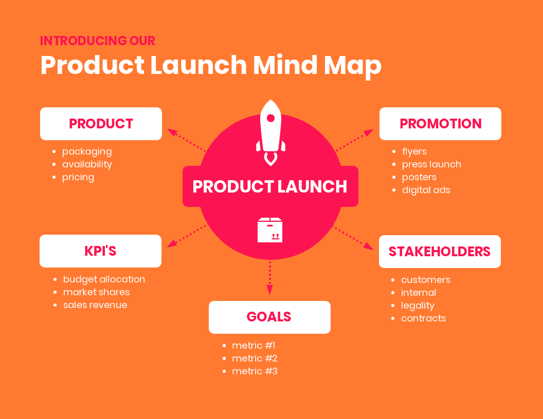
15. When needed, include a brief description of your mind map
Depending on the purpose of your mind map, you may need to offer a bit more context than just a few words provide. In those cases, it’s good practice to include a brief description of what the mind map is about.
For example, this mind map shows the main goals of a business growth strategy. A brief introduction under the title of the mind map helps readers understand how the different branches play into the strategy.

Create a mind map that works for you
These tips are a starting point for creating a mind map. Ultimately, the design choices you make should depend on the information you want to visualize, and the purpose of your mind map.
Think about your audience when creating a mind map: what information do they need to understand your mind map? How in-depth do you need to go? And what can you do to make your mind map more engaging?
Related design guides:
20 Timeline Template Examples and Design Tips
10 Flow Chart Templates, Design Tips and Examples

10+ Process Infographic Templates and Visualization Tips


0 Responses
Stay in touch with the conversation, subscribe to the RSS feed for comments on this post.