Ayone who follows this blog knows that I love infographics and the way, when they’re well done, they can communicate complex information.
Libraries have a very complex and complicated message about our value, our use, our role and more. So I was thrilled to see this blog posting that outlined the things you need to consider when making one.
What Makes a Good Infographic?
1. Design
2. Data
3. Clever Visualizations
4. Point of View
5. Location, Location, Location
6. Shareability
Check it out for insights like this:

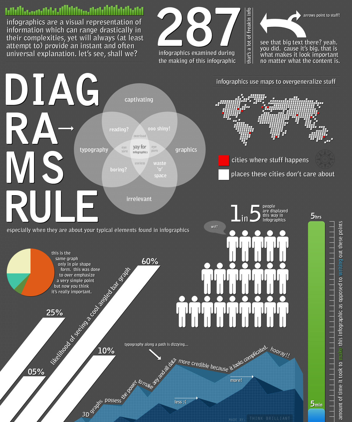
And sometimes you learn more by looking at a bad infographic:

Can you make an infographic poster for your library that communicates a message in a long glance as users
walk in the door?
Stephen

0 Responses
Stay in touch with the conversation, subscribe to the RSS feed for comments on this post.